4.28.2009

Ummmmm... hello?

I know I know... bad blogger. It's been crazy around here, so I won't be posting again until Friday or Saturday! I haven't been working on anything, so there's nothing really to post anyway :( All I have for you today is this "Goin' Green" recycled tag project that was done for Paper Wings:

The white border is a left-over from another card I had started. I had punched the center out and was left with this lovely square frame and HAD to use it. TAC's plastic clamshells that they ship their stamps in are so perfect for recycling by using the Big Shot and a Sizzix tag die. I applied a bit of acrylic paint to one side for texture.

The sentiment is layered and pop up with a pop dot, and the white mat was glued to the back side to hide pop dot. I used a bit of an old cotton pillowcase for the tag tie and ran it over the ink pad for color.

Stamps: Summer Elegance(retiring!!), Tag Tidbits
Inks: Belle Rose & Noir Palettes
Paper: Uptown Girl, misc. black & white cardstocks
Other: clear tag, cotton trim, paint, staple, pop dot
Sorry kids, that's it. I'm hoping to have some creative time Friday night {crossed fingers}!
What do you think?
.

4.24.2009

That's so sweet... I think I'm gonna hurl...


Happy Friday!! I want to share an anniversary card that I made for our neighbor across the street. Brian came over last weekend with this tag-shaped card... he said that he had dug around in his wife's (Cheryl) supplies and started to make her a card! How sweet is that?!
{ try to contain upchuck reflex :) }
Anyway, Brian said that he went through a bit of her papers and supplies & tossed them out before he gave up and asked me to finish it for him :) On the inside, Brian had attached a copy of their wedding photo (15 years!) and a typed letter to Cheryl... I didn't read it, but I'm sure it was absolutely sweet! He had matted the black/white photo with an aqua blue cardstock, so that's what I worked with on the outside.

Other: Angelee Ribbon, Turquoise & Tan Scrapper's Floss, Swimming Pool Posies, misc. button & flower, pre-made tag card, foam tape

I really like how it turned out! And here's a tip for getting nice and soft ink edging that I picked up from a fellow Angel, Beverly ... cotton pads that manicurists use! They are flat cotton discs with a mylar-type flap on the back that you can grip... and you don't even get messy fingers (on one hand, anyway!). I used a Sharpie fine tip marker and wrote the name of the ink used and store them in a big ziploc bag... this way I don't mix inks on the pads. AWESOME tool... thanks, Beverly!!

I don't think MY husband would ever try to make me a card... maybe that should be another challenge! LOL! See how many wives can get their hubbies to make a card... I wanna see some posts, ladies!!

What do you think?!
.

4.22.2009

Time to go TP'ing...

First off, go check out this awesome blog candy giveaway!! Copics & Nesties, oh my!


Ok, I've got the perfect guy card, here. I mean... it kinda looks like a guy made it :) Doesn't it look like a truck ran over it?! Well, it IS a toilet paper roll... yep, I have {insert obscene $$$ amount here} worth of papercrafting supplies, and I use a toilet paper roll :)


Early January, we had a "Goin' Green" theme for the Paper Wings Winger Design Team... so I tried to re-use / re-purpose as much as I could on this one card:


Stamps: This Boy ('idea' & 'explain' sentiments), With Sympathy ('so sorry')
Inks: Prussian Blue or Starry Night Palette (can't remember!!), Willow Walnut Ink
Paper: toilet paper roll, wine bag, Bazzill Mono-Yellow Greens
Other: Karen Foster brad, scrap of chipboard, cotton trim, sewing machine


I cut and flattened a toilet paper roll, leaving a bit of the white paper still attached, and sprayed it with the Willow Walnut Ink. I then took strips of an old cotton navy pillowcase and sewed them to the t.p. roll. I stamped the 'idea' sentiment on a scrap of chipboard, distressed & inked the edges and layered it on some Bazzill with a big antique brass brad. Everything was attached to a kraft paper wine bag that was folded in half and inked. The inside says: 'so sorry', and is stamped on Bazzill and layered on another piece of navy cotton.


I'm thinking the sentiment REALLY reads like a guy would be giving this card to someone...


What do you think?! ;)


***edited to add: BONUS... it's Earth Day today! What a happy accident to post a recyle project today of all days!

4.20.2009

Hello Birdie - Four Ways...

Today, I thought I'd illustrate how different a card can feel just by a subtle change in elements. I've created four cards using the exact same base elements (card base, wine & brown strip, & sentiment) and did a little switch-a-roo with the main image & embellishments.

Stamps: Friends & Forever Friends (both available thru April 30th only!)

Colorant & Technique: Prismacolor Pencils blended with mineral oil & blending stump

Other: Audrey Embellishment Jar, Dark Pink & Tan Scrapper's Floss, misc. buttons, foam tape, and Cuttlebug Embossing Folder

The first two have very subtle placement differences... simply stacking the bird/flowers above the sentiment, puts all of the 'weight' of the card to the lower right on the second one, rather than along the entire length of the bottom as in the first.

The second two cards change the card direction completely. The third card moves the flowers to form a kind of nest for the bird, while the fourth card echoes the flower placement of the first two. In both the third & fourth cards, all of the 'weight' is on the right-side of the layout.

What I did next, was take the first two versions and created a fifth card that had the placement I liked best, and used a white card base.

I switched the brown & wine strips and added a dotted line from Creative Inspiration in Noir Palette ink to tie in the image better with the base.
I wish the dotted line was a little less messy, but I guess it looks handmade, right?! :) So, which one is your favorite layout, and do you like the kraft card base or the white?
Challenge time!!!
Your mission, should you choose to accept it, is to create a minimum of three cards using the exact same elements and just vary the placement. I'm going to see if I can get the Linky box up, but I've been having issues :)

So... What do you think?
.

4.17.2009

How Tweet... Sweet Face :)

How Tweet

Only 6-1/2 months until Halloween :) Though this first card isn't really Halloweenie, it could be... I love how he is just sitting on the "T" like a perch. And yes, I know owls don't tweet... hence the question mark :)

The photo looks really dark, but the base is a very dark brown. The thick vanilla cardstock is almost like watercolor paper... I salvaged it from a store-bought card {gasp!} that was given to me. I used my Tombow markers to color the owl from Bird Cage instead of the Copics, but I want to do another one with Copics and one with Prismacolors & mineral oil to get some blending action goin' on.

I stamped the little "how" from Tag Tidbits in Burnt Umber Palette ink, and the "tweet" & owl in Noir Palette. I really like the simplicity to this one, even though there is not one teensie bit of foofiness anywhere... odd {like me}. :)

Sweet Face

I thought I'd also share a little scrap card. Once again, I dove into my pile o' scraps, and this is the result. If you remember this silhouette Hope card (scroll down a little) where I cut the face off & just used the hair part... yep, you guessed it... I saved the face :) I'm telling you, scrap-hoarding is like a sickness...

I'm lovin' the Genevieve paper (of course) and the cardstock is from Toodle Loo & DCWV. There is a little foam tape poppin' the image up, I added a Blossom & Button, little heart, & a bit of pink micro ribbon.

So...

What do you think?

4.14.2009

Brayer quickie...

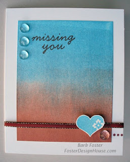
Gotta love quickies! Melisa issued a challenge to use your brayer, so I thought I'd do just that :)

This VERY plain & simple card was made by brayering Cosmic Copper Brilliance and Pearlescent Sky Blue Brilliance inks onto White UltraSmooth cardstock. I tried this on the Glossy cardstock, and I just couldn't get the brayer marks to blend like it does with dye inks. The White US worked perfectly! I did end up sponging just a little more copper on the bottom after I was done, but I don't think that is like, cheating or anything... is it, Melisa? :)

I stamped the dot border from Creative Inspiration inside and three small dots of it in the lower right corner of the front with Burnt Sienna. Also using Burnt Sienna, I stamped "missing you" from the Level A Hostess set Feel Better. I ran some misc. copper ribbon (from M's) through a slit made in the spine and used small Glue Dots to hold the ends down under the heart.

The heart was salvaged from my "I might use it someday" pile o' scraps! The little guy from the Level B Hostess set Criss Cross just so happened to be stamped in the same blue Brilliance ink (winner!!!!). I popped that baby up on a tiny piece of a Pop Dot. Finished the whole thing off with a few faux dew drops from M's.

I totally dig the color combo (hello... copper... need I say more?) and the sparkle to the ink... and the little lonely heart in the corner, but is it too simple? Too blah?

What do you think?

.

4.12.2009

A Christmas Peacock...

A real quick post tonight... I've got a ton of stuff to do tonight, and someone {cough... CINDY... cough} was letting me know that I need to update the blog again. So, Hag, this one is for you :) {mwah... big kiss} I haven't had much crafty time as of late, so I was happy to sit in my room today!

I had signed up to be part of a Paper Wings group to encourage eachother to create Christmas cards every month so that we aren't scrambling at the last minute (like I ALWAYS do). Well, I'm totalling sucking swamp water on my goal of completing 9 per month. This is only my second one, and I'm not EVEN going to share the first one I did... ugh. I do believe I will be scrambling once again this year :)

Merry Peacock

Stamps: Bird Cage, Linear Sentiments, Just For You (hostess level A)

Paper: Toodle Loo and White UltraSmooth cardstocks


Other: Lyra Watercolor Crayons, water mister, misc. ribbon, Nestabilities, Pop Dots, and 1" Circle Punch

I achieved the watercolor look to the bird image by coloring directly on the rubber stamp with the Lyras, mist with water, stamp off lightly, and finally stamp final image. I love the soft look, and will definitely be doing more of these!

I created the scallop border by layering circle halves... quick and easy, and you can really get some big scallops working! Also, while the large white circle was still in the Nestabilities die, I sponged Reflection Blue & Iris inks VERY LIGHTLY so that there is a white border left around the edge of the circle.
What do you think?
.

4.09.2009

Love and other stuff...

Ack! I know... I know... I am blog-slacking big time. But I've been going crazy with my Heidi... poor fur-baby... she had another eye surgery. I am a mess... I can't even imagine what it would by like to have human children. I do know that Heidi's college fund has been steadily going to the vet & ophathamologist in large amounts. I could kick myself for not getting pet insurance a couple of years ago.

So enough with the home life, and on to a little more love... yep, another installment for the Paper Wings Music of my Heart theme. First up...

Light My Fire Candle Tin
What better sentiment for a candle, right? :) I drew the heart on chipboard & then covered w/ cardstock before cutting out... I covered the chipboard flower w/ Uptown paper. I sponged all edges w/ Moulin Rouge (including the back of the chipboard elements).

I also sprayed the scarlet elements and back of chipboard w/ Silver Glimmer Mist. I thought the leaf image looked like a stylized flame, so I stamped that on another piece of Uptown paper. The tag sentiment is handwritten: "C'mon baby light my fire!"... thank you, The Doors :)

Stamps: Bold Flourishes
Paper: Uptown Girl, Cha Cha SWIC tag, Mono-Pinks Bazzill (tag), Scarlet cardstock
Inks: Moulin Rouge & Noir Palettes
Accessories: misc. ribbon, chipboard flower & heart, Micron journaling pen

Just a Love Note
The main image is supposed to look like a music note... I think it worked...

Stamps: Love Doodles, Punctuation, Trendy Greetings, Life is Short (little love sentiment), So Splattered (retired)
Paper: Scarlett & Black cardstock, White UltraSmooth
Inks: Moulin Rouge & Noir Palettes
Accessories: Tombow red marker, misc. ribbon
What do you think?!

.

4.05.2009

Paper Wings Scrappy Blog Hop!!!

How about another Blog Hop?! A bunch of Angels from Paper Wings decided to highlight how to use rubber stamping in your scrapbooks. I confess, it's hard for me to create a scrapbook page WITHOUT any stamping... the pages just seem a bit unfinished. If my fingers aren't inky when I complete a page, it's not complete ;)


Ink: Burnt Umber & Cognac Palettes, VersaMark

Other: Extra Jumbo Circle punch, Mega & Giga Scallop Square punches, Pop Dots, foam tape, faux dewdrops, blending pad

I decided to do a double-page layout that was almost mirrored... the inward facing photos helped guide this. I only used one tiny sliver of pattern paper (upper right of Heidi page)... and created the rest with stamps! The Script Background was stamped in VersaMark & Cognac (twice without re-inking), and the Dingbat medallion was also stamped in VM. I created movement with the punched Flourish by varying the position of the image, allowing part of the image to 'go off' the edge, and by popping some up on foam tape & pop dots. It is grounded by the addition of the dewdrops that are in a straight line.

Aren't my Heidi & Thor the CUTEST BABIES EVER?! Just to quote what you are thinking: {why yes, Barb... it is true... I have never seen ANYTHING cuter than these two} Just a little side note... my poor Heidi (the blonde) had to have one of her eyes removed due to a corneal-something and is now affectionately called Bruno. She looks like a total badass right now until her stitches come out in a couple of weeks, but I thought I'd document her in her glory days.

You can see more scrappy examples of mine HERE and HERE and don't forget to check out all of these wonderful Angels' scrappy rubber-stamped works:


What do you think?!
.

4.03.2009

Love and Frankenstein-ing...

Ok music lovers, this one is for you :) This is another past Wingers design team project for the Paper Wings Gallery. I really had fun with this one. The theme was "The Music of My Heart", so here is a little

Guitar Love:

Stamps: Forever Family, Go Abroad, Distressed Bet (retired), Too Much Fun (retired 'dude'), GWP (retired Rock!)
Inks: Pink Petunia VersaMagic, Noir Palette


Other: Pink & Platinum Stickles, misc. ribbon, foam tape, Spellbinders Ribbon Tag, edge distresser

I tried to create the look of a guitar by using the heart stamp from Forever Family & the floral-dot border from Go Abroad. I punched a circle in the heart and backed it with black cardstock to give the illusion of depth inside. I used the Platinum Stickles to create strings of the guitar, and as a little bling on the ribbon tag. And then even more Stickles for the flowers & centers on the guitar... because you just can't have enough, right? :)

This one was challenging and fun to create... I love making a new & unique image from Frankensteining a few stamps together. So, I think it's

CHALLENGE TIME!!

What new & unique image can you create by Frankensteining? Linky up in the comment section so we can see!!

What do you think?
.
***Don't forget to check out the great new specials from The Angel Company! I've got the new linkies in the right sidebar!!***
.